LOGO DESIGN
I create this logo... The new owner had big plans to revitalize the property. I started by making a custom lettering inspired by the hotels original signage. I decided to keep the graphic elements simple and more modern to find a balance between the hotel’s history and the plans the new owner had for its future.
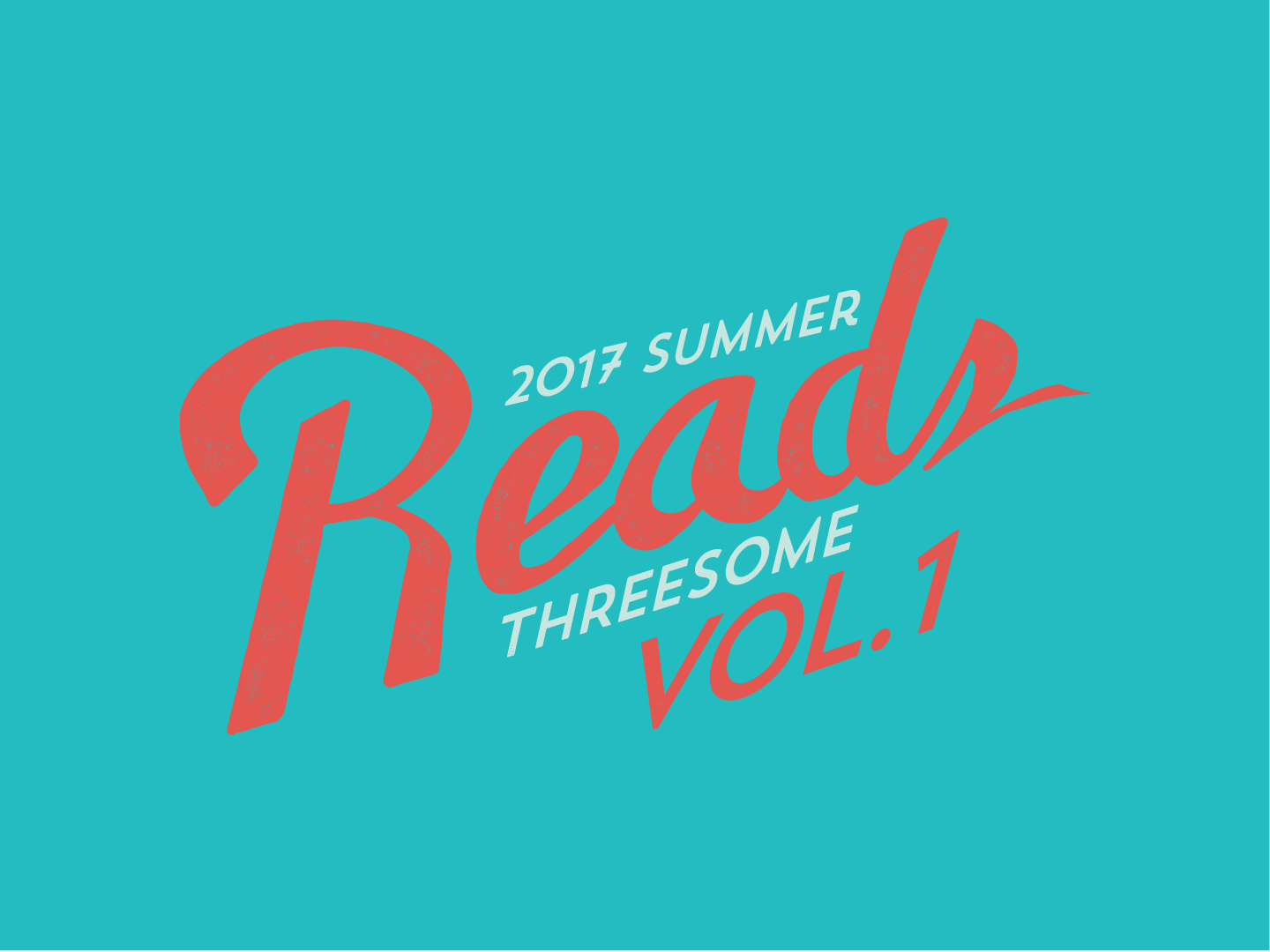
In my time as a graphic designer at Wordfest, the organization had a goal of expanding their reach and having events throughout the year. One of the approaches we used was creating branded series that would bring in a new audience. I created an energetic & bright design to communicate that Wordfest has something to for everyone, and to appeal to new demographics. The three events over the summer were all well attended and well received.
Skylines was created by two dancers one living in Calgary and one in Winnipeg. The festival has taken place in both cities and encourages the sharing of art and growth of these communities. The logo reflects this connection with simple graphic shapes showing the sun coming up over both the mountains and prairies.
The main goal designing this logo was to capture the feel of movement. The client wanted the logo to communicate three aspects of the business: Dance, Yoga, and Wellness. I worked with the client to produce a logo that incorporated not only the idea of its three branches, but with a dynamic use of negative space that signals movement and embodiment.
FALSE 9 LOGO - CASE STUDY
The False 9 is a soccer podcast produced in Halifax. The team wanted to adopt a more professional apperiance and decided to start that process with a logo.
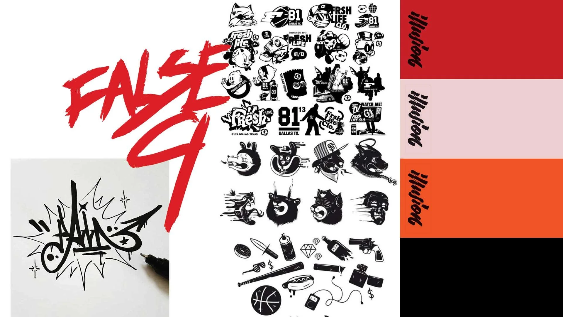
MOOD BOARDS
After my initial meeting with the client I started this project by researching other podcast logos. The logo is quite frequently going to be seen as a small thumbnail next to other podcasts. I knew the logo needed to stand out from what was already available. I felt that contrast and bold colours would be very effective at getting attention even when viewed at a small scale. After Identifying my goals I created two mood boards to make sure the client and I were on the same page and could agree upon a style.
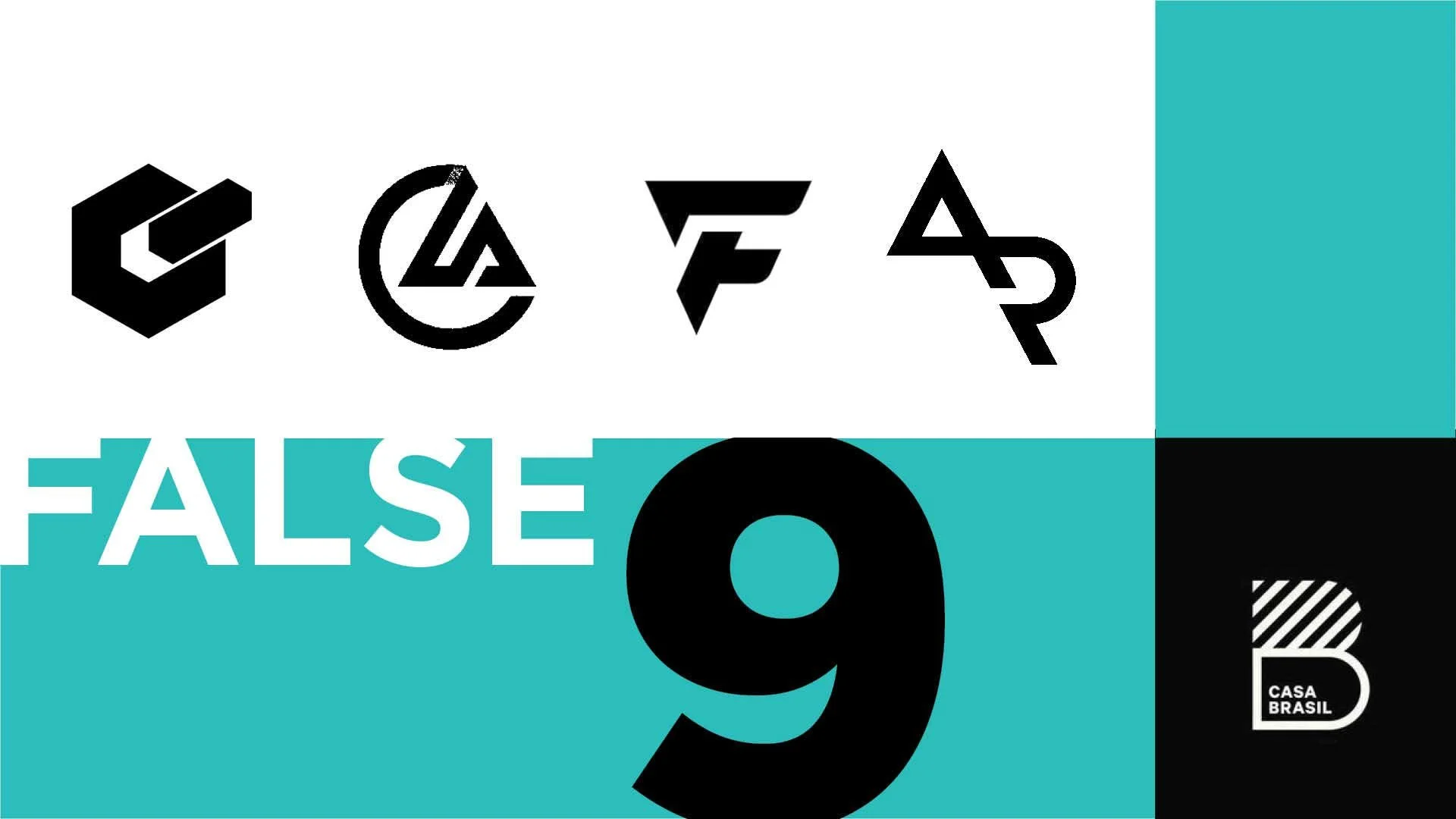
REFINEMENT
After the mood boards and idea generation the direction the logo becomes increasingly clear. I still like to do another comprehensive round of exploration, however, to make sure I’ve landed on the strongest solution possible. I narrowed it down to three options that I then presented to the client.
FINAL
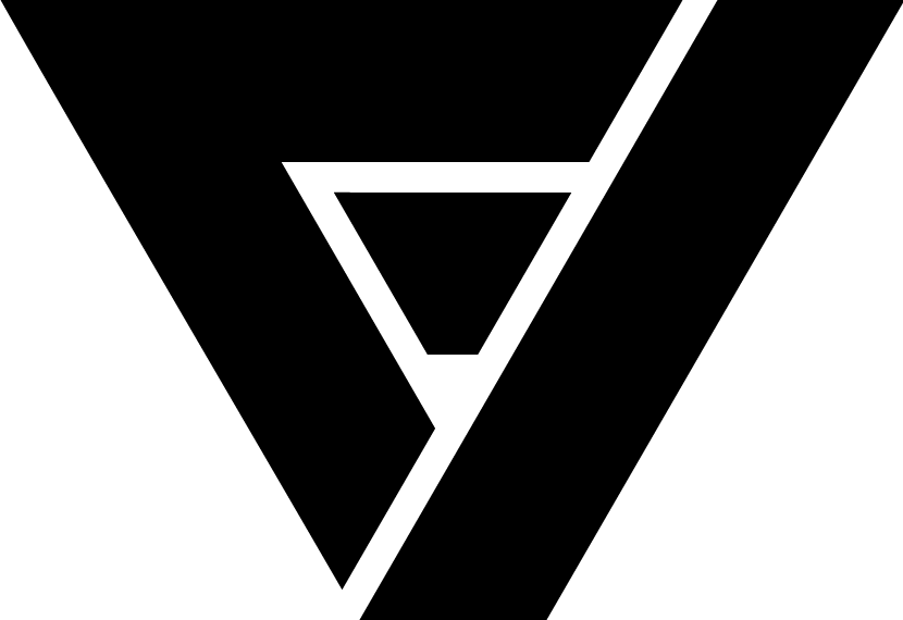
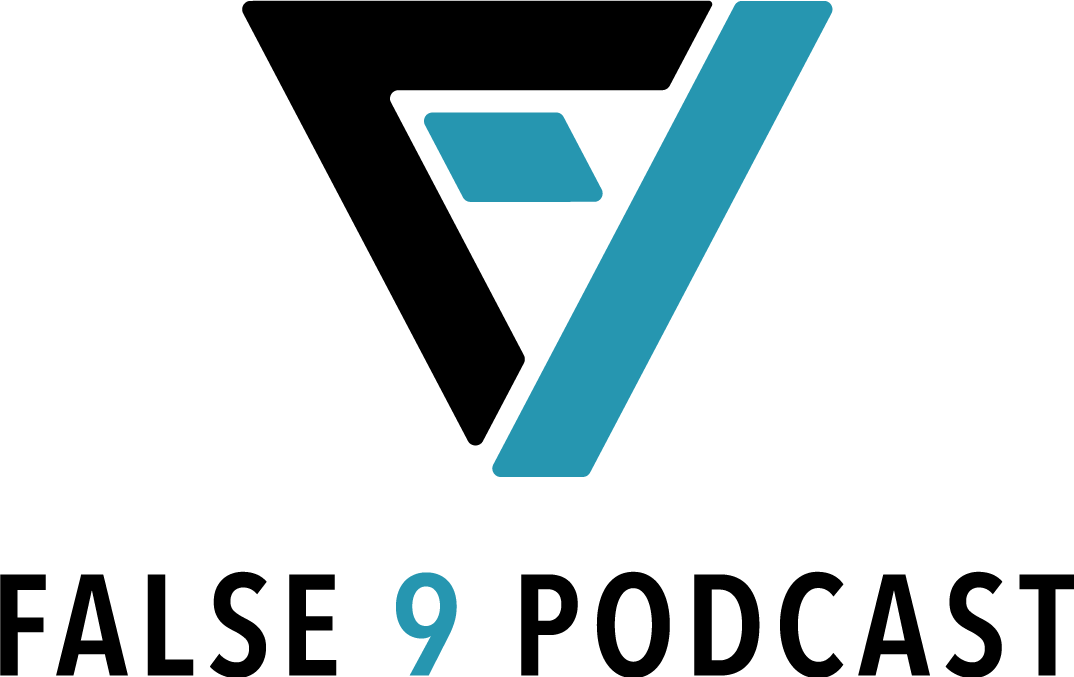
Colour and typography are the final pieces to complete the process. I researched and presented the strongest options. The final design accomplishes all the goals outlined at the start of the project. Through an iterative process I arrived at a unique high contrast design that will be effective at multiple sizes. The colour placement is used to separate the abstract shapes and make the F and the 9 more recognizable. The colour is most effective on the right side of the logo as it draws the eye down to the typography.
INITIAL CONCEPTS
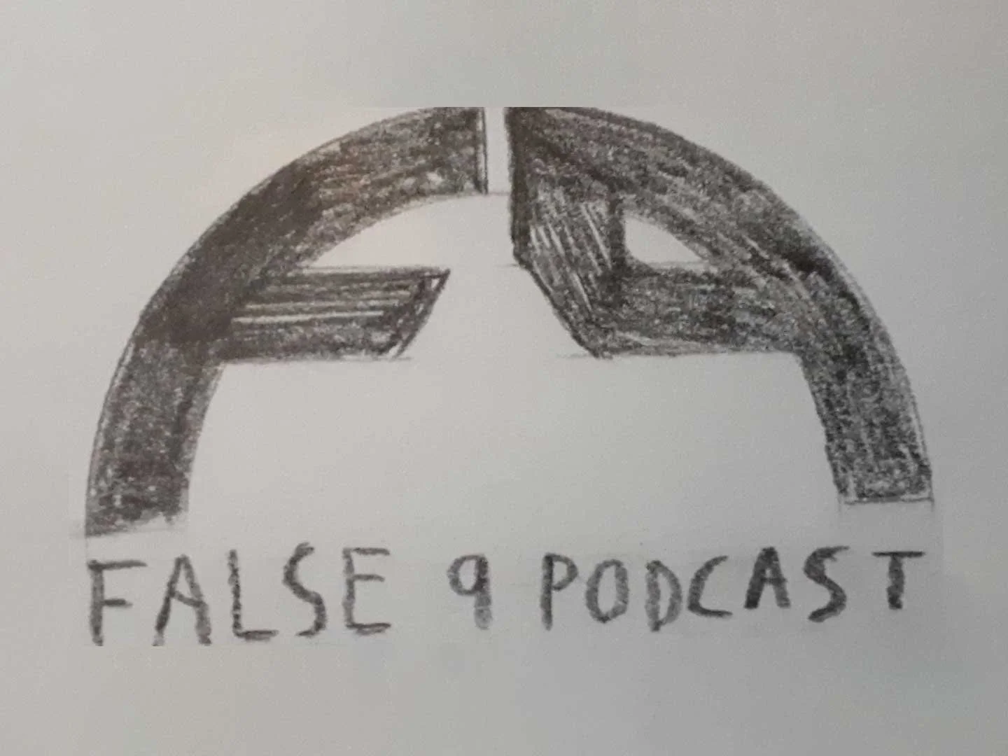
After selecting a direction I did a lot of sketching. This is one of the best ways to get a bunch of ideas down really quickly. After a thorough exploration I presented the strongest ideas to the client.

